Google Brings Liquid Glass and Material 3 Expressive Design to iOS Apps in Latest UI Overhaul

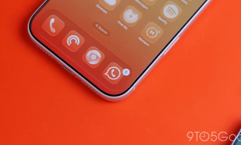
More than a year after the initial introduction of Apple’s translucent Liquid Glass interface design language, Google has begun systematically integrating the aesthetic into its extensive ecosystem of iOS applications. Alongside the adoption of this frosted-glass visual standard, the technology giant is aggressively rolling out its own Material 3 Expressive design framework to replace older, legacy interfaces that have persisted on Apple’s mobile operating system for years.
This shift marks a significant milestone in how major cross-platform developers approach iOS design guidelines. Historically, Google maintained a strict adherence to its own unified design language across both Android and iOS, often resulting in user interfaces that felt distinctly out of place on Apple hardware. With the latest updates to core applications such as Google Photos and Google Health, the company is demonstrating a pragmatic willingness to embrace platform-native visual cues while simultaneously modernizing its internal design language.
The Evolution of Google Photos on iOS
The most prominent implementation of the Liquid Glass aesthetic can be observed in Google Photos version 7.94. In previous iterations, the application relied on a solid background for its floating bottom navigation bar—a direct port of the design philosophy utilized in the Android version of the software. However, the new update transitions this essential UI component into a translucent Liquid Glass element, allowing underlying imagery to subtly bleed through the navigation container.
According to initial deployment observations, Google has built-in customization parameters for user preferences. The interface features distinct tiers of translucency, including a default setting that balances legibility with background visibility, and a more pronounced More Clear option designed to maximize the visibility of photographs positioned underneath the navigation bar. Furthermore, when operating in dark theme mode, the default blue accent color dynamically tints the active tab indicator, providing a cohesive visual hierarchy that respects both Google’s branding and Apple’s system-level dark mode conventions.
Beyond the bottom navigation bar, Google has extended the Liquid Glass treatment to secondary interface elements. Buttons housed within the top application bar have been redesigned to incorporate translucent properties, creating a unified top-to-bottom aesthetic that aligns closely with modern iOS interface standards seen in native Apple applications.
Expansion into Specialized Applications: Google Health
![Google combines Material 3 Expressive & Liquid Glass on the iPhone [Gallery]](https://9to5google.com/wp-content/uploads/sites/4/2026/03/Liquid-Glass-dock-on-iPhone-17-Pro-Max.jpg?quality=82&strip=all&w=1600)
The rollout is not confined solely to media management tools. Specialized productivity and lifestyle applications within Google’s portfolio are also receiving substantial visual overhauls. The Google Health application has recently updated its traditional bottom navigation bar to utilize the Liquid Glass framework.
Within this environment, users can clearly discern content scrolling beneath the primary navigation elements. Additionally, the application’s prominent Ask Coach floating action button (FAB) has been updated with a frosted glass finish, replacing the flat, solid-color styling of previous builds. This implementation demonstrates how Google is adapting its traditionally rigid floating action paradigms—a staple of Material Design—to fit the translucent, layered depth philosophy popularized by modern mobile operating systems.
The Phasing Out of Legacy Material Themes
For years, users navigating Google’s suite of applications on iOS have experienced a fragmented visual landscape. While some apps received timely updates, others lagged behind, continuing to utilize older iterations of the Google Material Theme.
The current software cycle represents an active effort to phase out these legacy frameworks in favor of Material 3 Expressive. While core productivity tools like Google Tasks received modernized updates in the recent past, applications such as Google Docs, Sheets, Slides, and Keep have notably lagged behind as stragglers in the transition timeline. Industry analysts note that updating complex, document-centric applications requires meticulous engineering to ensure that document canvases and editing tools do not suffer performance degradation or visual clutter when overlaid with translucent UI elements.
Chronology of Design Integration
To understand the current state of Google’s iOS interface strategy, it is essential to examine the chronological progression of its design language over recent years:
- 2021–2022: Google heavily pushes Material You and Dynamic Color across its Android ecosystem, while maintaining a standardized, cross-platform Material Theme on iOS that largely ignores native Apple design conventions.
- 2024–2025: Apple introduces the concept of Liquid Glass and deeper translucent UI hierarchies across its developer ecosystem, setting a new benchmark for depth and visual layering in mobile applications.
- Early 2026: Google marks one year of Liquid Glass availability by initiating broad code refactoring in key iOS applications to support translucent navigation layers.
- Current Phase (March 2026): Applications like Google Photos (version 7.94) and Google Health officially launch with Liquid Glass implementations, accompanied by ongoing migrations to Material 3 Expressive.
The Limitations of Dynamic Color on iOS
![Google combines Material 3 Expressive & Liquid Glass on the iPhone [Gallery]](https://9to5google.com/wp-content/themes/ninetofive/dist/images/google-preferred-source-badge-dark.png)
Despite the successful integration of Liquid Glass and Material 3 Expressive elements, a noticeable gap remains between Google’s Android and iOS design strategies: the absence of Dynamic Color.
On Android devices, Material You’s Dynamic Color feature extracts a user’s wallpaper palette and automatically themes the entire operating system and supported applications to match. However, Google has shown no substantive engineering interest in bringing this feature to its iOS application portfolio. Technical hurdles heavily influence this limitation. Because iOS sandboxing protocols restrict third-party applications from accessing the user’s system wallpaper data, implementing a true system-wide Dynamic Color engine is fundamentally unfeasible.
While Google could theoretically introduce a manual in-app color picker allowing users to select a universal accent color across all Google-branded apps, industry observers suggest such a feature offers limited utility. Without the dynamic, contextual adaptation derived from the device wallpaper, a manual accent color tool remains a distinctly Android-centric philosophy that struggles to find a natural home within the tightly regulated ecosystem of iOS.
Implications for Cross-Platform App Development
The quiet integration of platform-specific design paradigms by a major multi-platform developer like Google underscores a broader shift in mobile software engineering. As users increasingly expect applications to blend seamlessly with the host operating system, rigid, cross-platform design systems that force a uniform aesthetic across both Android and iOS are facing diminishing returns.
By adopting Liquid Glass for navigational layers while retaining its core Material 3 typography and structural layouts, Google is striking a pragmatic balance. This hybrid approach ensures that brand identity is preserved without alienating users who prioritize native visual coherence and modern interface depth. As the migration of remaining legacy applications continues through the remainder of the year, developers and consumers alike will be watching to see how far Google is willing to go in bridging the gap between its proprietary design philosophy and Apple’s hardware-software ecosystem.