Android 17 QPR1 Stable Release Introduces Surprising Status Bar Icon Changes on Pixel Devices

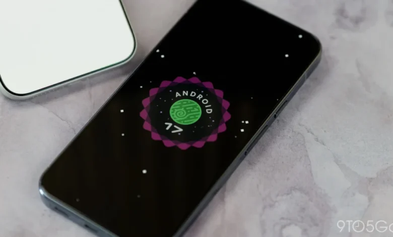
The recent rollout of the Android 17 Quarterly Platform Release 1 (QPR1) stable update has brought several unannounced and subtle visual modifications to Google Pixel devices, catching users and tech analysts by surprise. Most notably, the update alters familiar status bar iconography, sparking discussions within the Android community regarding whether these modifications represent a deliberate design pivot or an accidental software regression.
While major Android platform updates typically undergo extensive public beta testing phases where UI adjustments are scrutinized, feedbacked, and documented, these particular alterations managed to bypass the beta cycle entirely. They appeared exclusively with the official over-the-air (OTA) stable release, prompting a closer examination of Google’s current design consistency across the Android ecosystem.
Overview of the Visual Changes
The most prominent alteration introduced in the Android 17 QPR1 stable build involves the device’s silent and mute status bar indicators. Prior to this update, Pixel devices utilizing a silent profile displayed a crossed-out speaker icon in the status bar to denote that notifications and media sounds were suppressed. Following the QPR1 stable installation, this icon has reverted to a bell symbol.
This change represents a curious full-circle moment for Android interface design. Google originally utilized a bell-based iconography for notification states in older iterations of the operating system before making a deliberate switch to a speaker-centric design during the development cycle of Android 14. The return of the bell icon in the status bar creates a minor design discrepancy, as the quick-settings volume slider switcher at the top of the interface continues to utilize the bell, while the status bar had previously maintained the speaker representation.
Compounding the mystery of these undocumented tweaks is a secondary visual adjustment made to the virtual private network (VPN) indicator. The VPN icon has been redesigned to feature a much thicker, solid-filled graphical weight compared to the outlined variant present in previous builds. Like the mute icon modification, this heavier VPN graphic was entirely absent from the preceding beta builds and surfaced only when the stable software package reached consumer devices.
The Beta Disconnect and Timeline of Events
The sudden appearance of these icons highlights an unusual divergence between the software development kit’s testing branches and the final production code. Throughout the multi-month Android 17 QPR1 Beta testing cycle, which included numerous incremental updates, testers reported no alterations to either the mute or VPN status bar symbols.
To contextualize the timeline:
- Android 14 Development: Google transitioned away from the bell icon, standardizing the speaker motif for audio-related notification states to unify the visual language.
- Android 17 QPR1 Beta Cycle: Testers evaluated preview builds featuring standard, expected iconography with no indication of a forthcoming visual overhaul for the status bar.
- Stable OTA Rollout: The official production release deployed to compatible Pixel hardware unexpectedly contained the heavier VPN graphic and the reverted bell mute icon.
- Concurrent Beta Branches: Interestingly, subsequent development branches, such as Android 17 QPR2 Beta 5, continue to display the speaker icon in the status bar, further muddying the waters regarding Google’s intended design direction.
This technical paradox—where stable software diverges from concurrent and upcoming beta pipelines—suggests that these visual elements may have been merged prematurely from an experimental internal branch, or alternatively, that they represent an overlooked regression introduced during the final code compilation for the stable OTA.
Contextualizing Android Status Bar Evolution
The status bar is prime real estate in modern mobile operating systems. Every pixel is meticulously accounted for to maximize readability, convey critical system states, and maintain aesthetic harmony with the broader Material You design guidelines. Over the past decade, Google has iteratively refined the Android status bar, moving from dense, notification-heavy layouts to cleaner, more minimalist presentations.
Changes to universally understood symbols—such as those representing privacy (VPN) and sound profiles (Mute)—tend to draw immediate scrutiny from power users. The VPN icon, in particular, carries significant weight in modern computing, serving as an ongoing visual confirmation of encrypted network traffic. Thickening the icon alters its visual weight relative to adjacent indicators like Wi-Fi, cellular signal strength, and battery percentage, potentially disrupting the visual hierarchy that Google has spent years cultivating.
Similarly, the distinction between a bell and a speaker has long been a subject of UI debate across various mobile platforms. While a bell traditionally signifies notifications (ringing versus silent), a speaker relates directly to media and system audio output. By employing a bell for a silent profile, the system relies on contextual metaphor rather than direct object representation, which can occasionally lead to ambiguous user interpretation.

Potential Implications and Remediation
As of now, Google has not issued an official statement or advisory clarifying whether the altered icons are intentional refinements or bugs. However, historical precedents within the Android development ecosystem offer clues as to how this situation may unfold.
If these modifications are indeed accidental regressions—a distinct possibility given their absence from the QPR1 beta builds and their non-existence in contemporaneous QPR2 beta releases—users should not expect an immediate patch. Standard operating procedure for Google involves bundling minor bug fixes and aesthetic corrections into larger, scheduled feature drops rather than issuing standalone hotfixes for non-critical UI discrepancies.
Consequently, a reversal or standardization of these icons may not materialize until the deployment of the sizable QPR2 update, scheduled for release later in the year. Furthermore, the rollout of these updates varies by hardware generation; notably, the Android 17 QPR1 package has not yet been extended to the newer Pixel 11 series devices, meaning users of those specific handsets may experience a different visual baseline entirely when their respective software packages mature.
Broader Analysis of Release Stability
Incidents of minor, undocumented visual regressions slipping into stable software builds underscore the immense complexity of maintaining modern mobile operating systems. With millions of lines of code, multiple concurrent development pipelines (such as active QPR branches and major yearly releases), and diverse hardware portfolios ranging from older Pixel iterations to upcoming flagship tiers, synchronization challenges are bound to occur.
For the end-user, these changes are largely cosmetic and do not impact the core functionality, security posture, or performance of the device. However, for UI/UX designers and ecosystem analysts, they serve as a fascinating case study in release management. Whether these icons remain a permanent fixture of the Android 17 interface or are quietly phased out in a subsequent quarterly update will ultimately depend on internal design reviews at Google and the volume of feedback submitted via the Issue Tracker during this current release cycle.