Google Messages introduces significant UI overhaul with new gesture controls and enhanced long-press menus

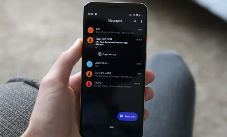
Google Messages is currently undergoing a substantial user interface transformation, marking one of the most significant shifts in how Android users interact with their primary communication platform. These updates, which have been spotted in recent server-side rollouts, fundamentally change the gestural navigation and contextual menu interactions that have served as the foundation of the app for years. By prioritizing efficiency and a more intuitive, modern design language, Google is aiming to streamline the messaging experience, moving away from rigid top-bar toolbars toward a more fluid, context-aware environment.
The Shift to Floating Contextual Menus
The most immediate change users will notice is the departure from the traditional top-mounted toolbar. Previously, when a user long-pressed a message bubble, a series of icons would appear at the top of the display, often requiring the user to reach across the screen to perform simple tasks like copying, deleting, or starring a message. The new implementation replaces this with a floating, context-sensitive menu that appears directly adjacent to the selected message bubble.
This design philosophy aligns with broader trends in mobile UX, where keeping interactions within the "thumb zone" of the device is paramount for ergonomics. The new floating menu provides immediate, localized access to core functions, including Reply, Forward, Copy, Star, Delete, Select More, and Info. For multimedia content, such as images or videos, the menu dynamically expands to include specialized options like Save and Remix. This shift is not purely aesthetic; it serves to reduce the cognitive load on the user by keeping all interaction controls in a unified, consistent location. Furthermore, as the menu appears, the background of the conversation window blurs, drawing the user’s focus entirely to the available actions and minimizing distractions.
Evolution of Text Selection and Data Handling
Beyond navigation, Google has implemented a long-requested feature regarding text selection. Historically, Google Messages forced a "copy-all" behavior, which often proved cumbersome when a user only needed a specific string of data—such as a phone number, a URL, or a street address—from within a larger block of text.
The updated functionality allows users to perform a secondary tap after initiating the selection process, granting them granular control over which portions of a message to copy. This is a significant quality-of-life improvement that brings the app into parity with other major productivity and communication tools. Google has confirmed that these touch-and-hold improvements are not limited to text; they extend to a comprehensive range of file types, including videos, links, files, physical locations, and contact cards. This versatility is a direct response to the increasing role of Google Messages as a repository for digital information, not just a tool for conversational text.
Redefining Gestural Navigation
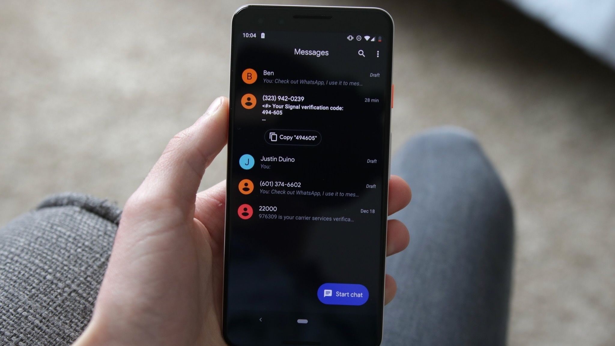
The most challenging aspect for long-term users will likely be the adoption of new, updated gesture controls. These changes represent a departure from the muscle memory established over years of Android usage. The new gesture architecture is designed to make scanning long conversations faster and more efficient.
Under the current system, swiping left anywhere in the conversation window now triggers a reveal of individual message timestamps and the current RCS (Rich Communication Services) encryption status. This change allows users to view the temporal flow of a conversation at a glance, rather than having to tap on individual message bubbles to view message details—a tedious process in fast-paced group chats or long, ongoing threads.
Conversely, the act of replying has been standardized to a right-swipe gesture performed directly on the message bubble. While this may feel counter-intuitive to users accustomed to the previous UI, it serves to separate the act of "viewing metadata" from the act of "responding to content." To ease this transition, Google has implemented a subtle UX prompt: when a user taps a message, the app briefly displays the timestamp, serving as an educational nudge to encourage the use of the new swipe gesture for more comprehensive information.
Chronology and Rollout Strategy
The implementation of these features follows a period of intense development and testing by Google’s engineering teams. The features were first hinted at through APK teardowns earlier in the year, which suggested that Google was experimenting with ways to make the interface more "dynamic."
The rollout is officially linked to builds beginning with 20260910_03_RC02. However, it is important to note that the feature is being deployed via a server-side update. This means that even users on the latest version of the application may not see these changes immediately. Google’s strategy of phased, server-side releases allows the company to monitor for potential bugs or UI conflicts across the vast, fragmented landscape of Android devices before enabling the features for the entire user base.
Analysis of Implications for Android Messaging
The move to update the Google Messages interface is not merely a cosmetic choice; it is part of a broader strategic initiative to cement RCS as the premier messaging standard for Android. By making the interface more robust, feature-rich, and user-friendly, Google is directly challenging the user experience dominance historically held by competitors like Apple’s iMessage.
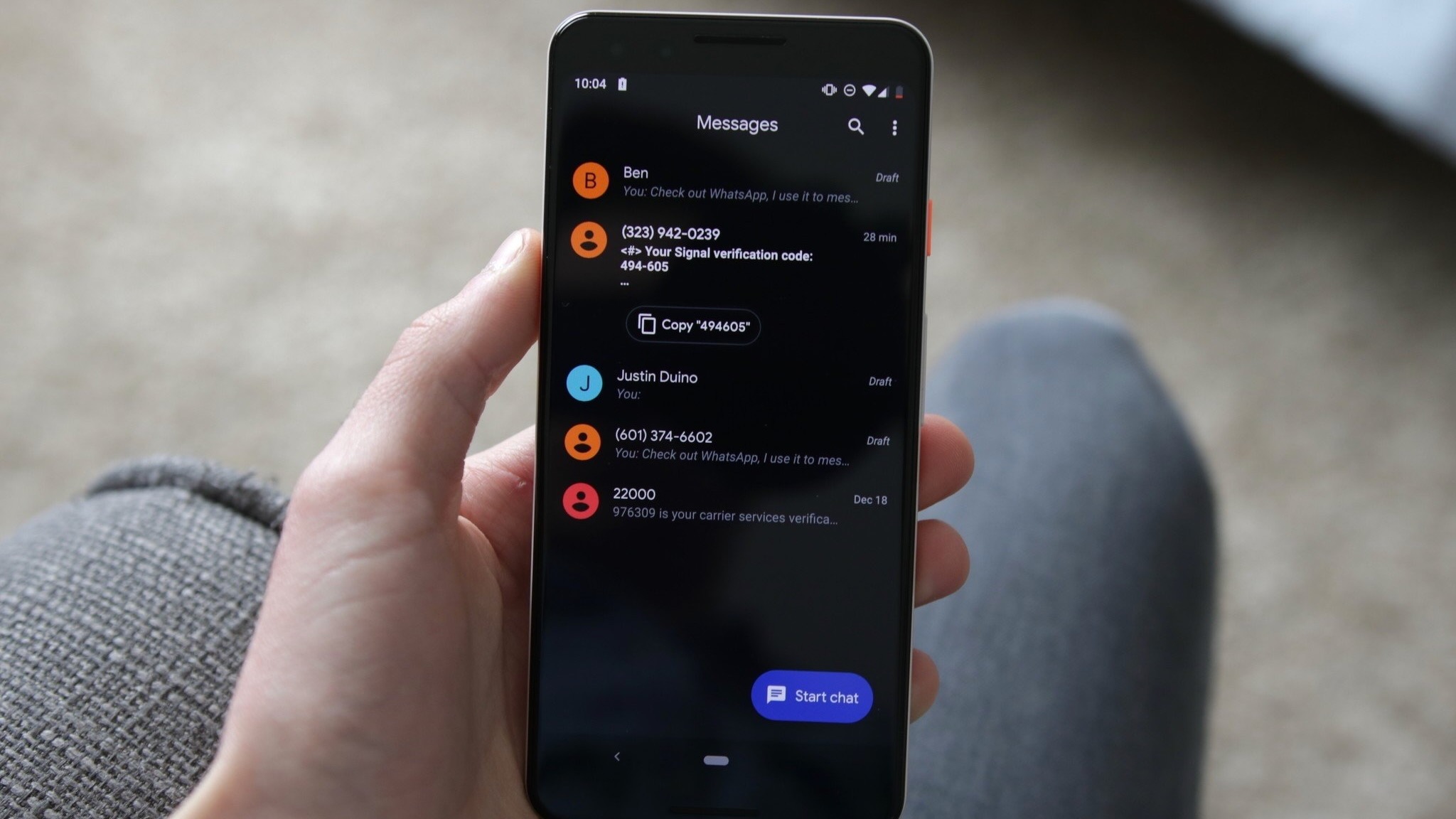
The integration of granular text selection and dynamic floating menus suggests that Google is viewing the messaging app as a productivity hub. In an era where two-factor authentication codes, shipping tracking numbers, and digital tickets are frequently delivered via SMS/RCS, the ability to quickly interact with that data is essential. The inclusion of the "Remix" option for images is a clear nod to the younger demographic, emphasizing that the platform must remain entertaining while simultaneously serving as a professional tool.
Furthermore, the focus on metadata—specifically the ability to quickly scan timestamps for an entire conversation—addresses a common pain point in modern communication. As people rely more heavily on asynchronous messaging, the ability to reconstruct the timeline of a conversation without excessive clicking is a vital feature for clarity and accountability.
Broader Context and Industry Impact
Google has been under pressure to ensure that its messaging platform remains competitive. With the widespread adoption of RCS, the technical barriers to high-quality communication have been lowered, shifting the competition entirely to the user interface and the feature set.
Industry analysts suggest that these changes are likely to be well-received, provided the learning curve for the new gestures does not alienate long-term users. By providing visual cues, such as the blurred background and the brief display of timestamps, Google is attempting to mitigate the friction associated with these updates. The consistency of these features across text, images, and files also points to a more unified design language, which is essential for maintaining the "Material You" aesthetic that Google has championed across the Android ecosystem.
Looking Ahead
As Google continues to iterate on its communication software, users can expect further refinements in how content is handled. The current update acts as a bridge between the traditional SMS-style messaging of the past and a more sophisticated, data-rich future. The success of this rollout will be measured by user retention and the reduction of support inquiries regarding how to perform basic tasks like replying or checking timestamps.
For power users, these changes offer a more efficient way to manage communication, effectively shortening the time it takes to perform routine tasks. For the average user, the interface feels more modern, responsive, and aligned with the high standards set by modern mobile applications. While any change to established muscle memory carries a risk of initial frustration, the long-term benefits of a more intuitive and feature-dense interface are expected to outweigh the temporary period of adjustment. As the rollout continues to reach devices globally, the community will be watching to see if any further adjustments are made based on user feedback, reinforcing the iterative nature of software development in the modern era.