Google Apps on iOS Begin Adopting Liquid Glass and Material 3 Expressive Design

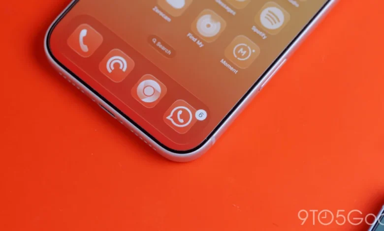
The landscape of mobile user interface design is undergoing a subtle yet significant evolution as major technology ecosystems continue to blur the aesthetic boundaries between rival operating systems. One year after the initial introduction of the translucent design aesthetic known as Liquid Glass, Google has officially begun rolling out comprehensive design updates to its suite of productivity, health, and media applications on Apple’s iOS platform. This visual overhaul merges the company’s burgeoning Material 3 Expressive design language with Apple’s native interface philosophies, marking a departure from rigid cross-platform design parity toward a more adaptive, context-aware user experience.
The integration is most prominently visible in recent application updates, such as Google Photos version 7.94, which replaces the traditional solid-background floating bottom bar with a dynamic, frosted-glass equivalent. As developers across the industry seek to balance uniformity with platform-native familiarity, Google’s latest stylistic shift highlights the ongoing challenge of maintaining a coherent brand identity while respecting the distinct visual guidelines of the host operating system.
The Evolution of Liquid Glass on iOS
Introduced roughly a year ago, the Liquid Glass design paradigm was conceived to introduce depth, spatial awareness, and fluid light-scattering effects into digital interfaces. Unlike earlier flat design languages that relied purely on solid colors and sharp borders, Liquid Glass leverages translucency, blurred backgrounds, and subtle reflections to create a sense of layering. This approach allows foreground elements—such as navigation bars, floating action buttons (FABs), and toolbars—to sit dynamically atop content without entirely obscuring the visual context underneath.
For iOS users, this represents a notable departure from how Google applications have historically looked and behaved. In the past, Google’s cross-platform strategy frequently emphasized maintaining identical user interfaces across both Android and iOS, often resulting in apps that felt slightly foreign to iPhone users accustomed to native human interface guidelines. By embracing Liquid Glass and Material 3 Expressive, Google is acknowledging that modern iOS users expect a level of visual integration that respects the underlying operating system’s design cues, particularly regarding translucency, depth, and spatial hierarchy.
![Google combines Material 3 Expressive & Liquid Glass on the iPhone [Gallery]](https://9to5google.com/wp-content/uploads/sites/4/2026/03/Liquid-Glass-dock-on-iPhone-17-Pro-Max.jpg?quality=82&strip=all&w=1600)
Recent Application Updates and Visual Changes
The rollout of Liquid Glass within Google’s iOS ecosystem is expanding across multiple application categories, bringing modernized UI elements to some of the company’s most widely used tools.
Google Photos Version 7.94
In Google Photos version 7.94, the floating bottom navigation bar has transitioned from a solid, opaque background to a translucent Liquid Glass surface. This change mirrors aesthetic choices found within Apple’s own native iOS applications. Users are presented with distinct translucency settings, including a "Default" mode and a "More clear" option. The latter allows a significantly higher volume of the underlying photo or video content to shine through the navigation element.
Additionally, when operating in dark theme mode, the default blue accent color intelligently tints the current tab indicator, creating a cohesive visual feedback loop that responds to the content displayed on the screen. Beyond the bottom bar, Google has also updated the interactive buttons located within the application’s top navigation bar, ensuring consistent application of the frosted-glass aesthetic throughout the primary user pathways.
Google Health and Floating Action Buttons
The Google Health application has similarly adopted the Liquid Glass treatment for its traditional bottom navigation bar. Users can now observe underlying dashboard elements and text scrolling beneath the navigation container. Furthermore, the application’s prominent "Ask Coach" floating action button (FAB) has received a frosted visual treatment, separating it visually from the standard interface layers and signaling its interactive priority to the user.
Productivity Suites and the Phase-Out of Older Design Languages
Despite these notable updates, Google’s broader transition away from the older Google Material Theme on iOS remains an ongoing, phased process. While applications like Google Tasks received modern interface updates relatively recently, other core productivity mainstays—including Google Docs, Google Sheets, Google Slides, and Google Keep—have experienced slower integration timelines. These applications continue to operate with legacy design components, creating a fragmented visual experience across Google’s total iOS portfolio. Industry analysts note that standardizing a massive suite of cross-platform applications requires meticulous staging to avoid disrupting enterprise workflows and daily user habits.
![Google combines Material 3 Expressive & Liquid Glass on the iPhone [Gallery]](https://9to5google.com/wp-content/themes/ninetofive/dist/images/google-preferred-source-badge-dark.png)
Technical Challenges and the Absence of Dynamic Color
While the incorporation of Liquid Glass represents a major step forward for Google’s iOS design language, the company’s cross-platform strategy continues to face limitations inherent to operating system architecture. Most notably, Google has shown no commercial or technical interest in bringing "Dynamic Color"—a cornerstone feature of Material You on Android—to iOS applications.
Dynamic Color relies on deep system-level access to the device’s wallpaper, dynamically extracting color palettes to theme the entire operating system and its installed applications. Because iOS tightly restricts third-party applications from accessing system-level wallpaper data and global accent configurations, implementing a true Dynamic Color engine is technically unfeasible.
Although Google could theoretically introduce a manual system allowing users to select a custom accent color that applies uniformly across all Google apps, developers and UI experts argue that such a feature would feel disconnected without automatic wallpaper extraction. Consequently, Dynamic Color remains a deeply entrenched, platform-exclusive feature of the Android ecosystem, forcing Google to rely on static accent colors and contextual translucency—such as Liquid Glass—to modernize its iOS software footprint.
Broader Industry Implications
The gradual convergence of design languages between Android and iOS applications points to a mature phase in mobile software development. Rather than forcing a rigid, monolithic design framework across all operating systems, major technology conglomerates are increasingly adopting hybrid methodologies. By combining proprietary design languages like Material 3 Expressive with platform-native techniques such as translucent glassmorphism, developers can deliver experiences that feel both uniquely branded and natively comfortable to the user.
As Google continues to phase out its older design systems on iOS in favor of Liquid Glass and updated typography, spacing, and layout rules, the overall user experience across Google Photos, Health, and the productivity suite is expected to achieve greater visual harmony. For iPhone users, these updates signal a welcome shift toward software that respects the aesthetic sophistication of modern mobile hardware, reducing the friction historically associated with using cross-platform applications.